LAW FIRM SEO CHAPTERS
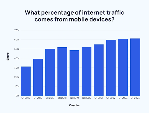
Did you know that more than 50% of all internet traffic originates from mobile devices rather than desktop computers? This significant shift is one reason why Google uses mobile-first indexing, a method that prioritizes a website’s mobile version for indexing and ranking purposes.
If you haven’t yet prioritized mobile optimization for your website, now is the time to act. The importance of this step cannot be overstated, particularly in the wake of Google’s Mobile-First Indexing update, which was officially announced in October 2023 after years of anticipation.
Google recently announced that after July 5, 2024, they will no longer crawl and index sites that do not work on mobile. According to John Mueller from Google, “The small set of sites we’ve still been crawling with desktop Googlebot will be crawled with mobile Googlebot after July 5, 2024…”
With Mobile-First Indexing now the norm, it’s crucial to grasp its significance. Essentially, Google will prioritize assessing and indexing your website’s mobile version over its desktop counterpart. This shift means that, no matter how well-designed and efficient your desktop site is, the mobile version will play a more significant role in determining your search engine rankings and overall visibility.
What is Mobile-First Indexing?
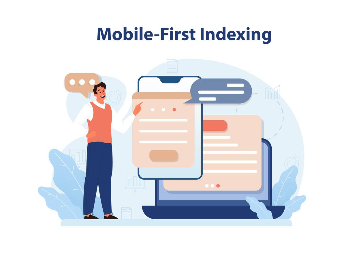
“Google predominantly uses the mobile version of a site’s content, crawled with the smartphone agent, for indexing and ranking. This is called mobile-first indexing.” – Google’s Definition
Since 2016, Google has been gradually transitioning to a mobile-first indexing approach. With this fully in effect, all websites, regardless of their age, will be primarily crawled by the mobile Googlebot. This ensures that the content indexed aligns with what is visible on mobile devices. Additionally, every ranking signal, from page titles to internal links, will be derived from the mobile version of the website.
In essence, your website’s mobile version will now serve as the main information source for Google, playing a crucial role in determining your search rankings.
Mobile-First Indexing Timeline
In 2016, Google announced its transition to mobile-first indexing. As of May 2023, all websites have successfully made this shift. Remarkably, it took over six years to complete the rollout!
Here’s a more detailed timeline:
- April 2015 – Google introduces the Mobilegeddon update, incorporating mobile-friendliness as a critical ranking factor.
- November 2016 – Mobile-first indexing is announced and begins testing on select sites.
- March 2018 – Mobile-first indexing begins its broader rollout.
- December 2018 – Over 50% of crawled sites have transitioned to mobile-first indexing.
- July 2019 – Mobile-first indexing becomes the default for newly launched sites.
- March 2020 – More than 70% of crawled sites are now using mobile-first indexing. Google also announced that mobile-first indexing will apply to all sites by September 2020.
- July 2020 – The onset of the coronavirus pandemic delays the complete transition to mobile-first indexing until March 2021.
- March 2021 – A tentative full rollout of mobile-first indexing begins.
- February 2023 – Some sites are still transitioning to mobile-first indexing, while others remain on desktop-only indexing due to technical constraints.
- May 2023 – The last sites complete their transition to mobile-first indexing, though a few sites will remain on desktop crawling due to mobile incompatibility.
- July 2024 – Sites with content inaccessible on mobile devices will no longer be indexed.
How Does Mobile-First Indexing Work?
You’re familiar with the concept of mobile-first indexing, but how does Google’s mobile-first index operate?
Consider this: Most websites come in two versions—mobile and desktop.
Previously, Google’s indexing process would prioritize the desktop version of a site as the primary reference for ranking. However, with the shift to mobile-first indexing, Google now uses the mobile version as the primary source for determining rankings.
It’s important to clarify that mobile-first indexing does not involve creating a separate mobile-specific index. Google continues to use its original index, but now it gives precedence to mobile versions of sites over their desktop counterparts.
Why is Mobile-First Indexing Important?
Mobile-first indexing is crucial in today’s digital landscape because it prioritizes the mobile version of your website for indexing and ranking. With the majority of web traffic coming from mobile devices, Google has shifted to evaluating mobile sites first to deliver the most relevant results to users. This means that if your mobile site is slow, hard to navigate, or lacks content compared to your desktop version, it could negatively impact your search engine rankings.
The importance of mobile-first indexing also extends to user experience. A mobile-optimized site ensures that visitors have a seamless experience, which can lead to longer visit durations, lower bounce rates, and higher conversion rates. Additionally, mobile-first indexing reflects a broader trend toward mobile usage, making it essential for businesses to adapt and provide content that meets the needs of mobile users. By focusing on mobile-first indexing, you can enhance your visibility, improve user satisfaction, and stay competitive in an increasingly mobile-centric world.
The Reason Behind the Switch
In response to the dynamic changes in user behavior trends, Google introduced mobile-first indexing. Over the years, mobile traffic has surged dramatically, making mobile web browsing a fundamental part of everyday life. In 2021-22, Statista research indicated that mobile devices accounted for 55.68% of internet searches, surpassing the 41.45% generated from desktops.
Further underscoring the significance of mobile, a 2023 Pew Research Center study highlighted that 76% of U.S. adults now prefer making online purchases via smartphones. This shift in consumer behavior has led Google to emphasize the importance of mobile-friendly websites in its indexing process, reflecting the increasing dominance of mobile browsing.
According to a report by Exploding Topics, mobile devices now account for 61.95% of all website traffic as of August 2024. This marks a significant rise from just 6.1% in 2011. By 2015, the share of mobile traffic had grown to 37.2%.
The trend of increasing mobile usage has continued year after year, with Q1 2017 being the milestone when mobile traffic first exceeded that from desktop computers.
Best Practices For Mobile-First Indexing
To optimize user experience and improve search engine visibility, consider implementing these best practices for mobile-first indexing.
1. Ensure Your Content is Mobile-Friendly and Responsive
To provide a smooth and unified user experience across both mobile and desktop platforms, implementing a responsive design is crucial. This design approach must address the needs of both users and search engines by ensuring that your site adapts effectively to different screen sizes, orientations, and devices.
Key elements of an effective responsive mobile design include:
- Maintaining consistent on-page content between mobile and desktop versions.
- Using clearly defined HTML headers (H1, H2, etc.) for better organization and readability.
- Incorporating structured data to enhance meta information and improve search engine understanding.
2. Check if You Are Blocking Mobile Resources
For Google to index content from a website, it first needs to crawl the site. As Google explains, “A page is indexed by Google when it has been visited by the Google crawler (‘Googlebot’), analyzed for content and meaning, and then stored in the Google index.”
A robots.txt file provides instructions for search engines, guiding crawlers such as Googlebot during their exploration of your site. This file allows you to direct Googlebot away from certain pages or resources.
However, complications can arise if you use a robots.txt file or meta tags to block essential mobile resources.
For example, the following code in a robots.txt file would prevent search engines from accessing mobile resources:
Another common mistake is including meta tags on a page that inadvertently blocks Google from crawling your website.
3. Optimize Images and Other Media for Mobile Devices
Images vary greatly in size, which can pose challenges for image SEO, particularly on mobile devices. Properly sizing and compressing images can significantly enhance page load times and improve the overall user experience on mobile platforms.
- Use High-Quality Images: High-resolution images not only elevate the visual appeal of your website but also convey a sense of professionalism and credibility to your audience.
- Avoid Unsupported Image Formats: Steer clear image formats that may not be compatible with all browsers or devices to ensure a uniform viewing experience for every user.
- Use Stable URLs: Implement stable URLs for images to prevent disruptions during page loads and maintain a smooth browsing experience as users navigate your site.
- Ensure Consistent Alt Text: Use uniform alt text for images across both mobile and desktop versions to provide accurate descriptions, enhancing accessibility and optimizing search engines.
- Maintain Consistency in Titles, Captions, and File Names: Keep titles, captions, and filenames consistent across devices to facilitate seamless navigation and help users easily identify and understand image content, regardless of the device they use.
4. Structured Data Alignment
Structured data serves as a blueprint, directing search engines through the complex layers of your web content. By maintaining consistency across various versions of your site, you ensure that Google comprehends your content uniformly, no matter the device used. This consistency not only improves the precision of search engine indexing but also strengthens your online presence, boosting your website’s relevance and visibility. Aligning your structured data is a strategic move that enhances your site’s discoverability and ensures it communicates effectively with search engines.
5. Page Speed Optimization
To enhance your website’s performance, pay special attention to optimizing page speed, particularly for mobile users who may encounter issues like unreliable connections and limited processing power. Fine-tuning your website’s loading times will provide a smoother, more efficient experience. Mobile users value quick-loading pages, and search engines often prioritize responsive sites in their rankings. By focusing on improving mobile page speed, you not only align with user expectations but also boost your site’s overall search engine ranking.
Mobile-First Indexing Auditing Tools
Here are a few budget-friendly strategies to audit web pages and assess their compliance with best practices for mobile-first indexing.
1. Google Search Console
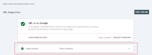
To verify if your content is being crawled by Google Smartphone, the most effective approach is to use the Google Search Console Inspection Tool to check a URL.
Follow these steps to determine if Google is crawling your website with Google Smartphone:
- Open Google Search Console and Add a URL in the Top Search Bar
- Click on the Dropdown Arrow To the Right of “Page is Indexed.”
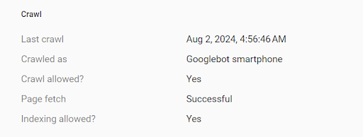
- Scroll down to the section that says “Crawl” to view “Crawled as” and see the Mobile Indexing.
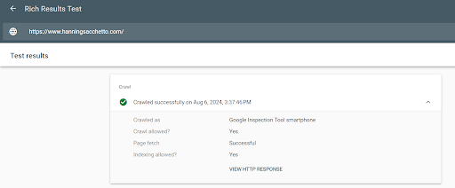
2. Rich Results Test
Google’s Rich Results is an invaluable tool for gaining insights into how Google interprets and interacts with your content. Additionally, it offers a unique perspective on how Google perceives the content of your competitors.
To understand how Google evaluates your mobile content using the Rich Results Test, follow these steps:
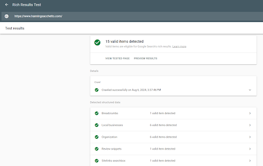
- Enter the URL you want to test in the “Enter a URL to test” field.
- Run the test.
After running the test, you can explore various aspects of the Rich Results Test, including:
- A screenshot showing how Google views the mobile content.
- Detected structured data.
- Information on whether indexing is allowed.
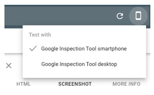
- Options to view the desktop version of the Rich Results Test.
Main Rich Results Test Page
Additional Information about Crawling and Indexing
Options for Smartphone and Desktop
3. Chrome Developer Tools
At first glance, Chrome Developer Tools may seem technical and overwhelming. However, it is an invaluable resource for viewing how your website appears on various mobile devices. This comprehensive suite of web development and debugging tools provides essential assistance in identifying and addressing issues specific to mobile devices.
4. PageSpeed Insights
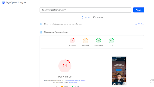
PageSpeed Insights is an invaluable tool for auditing not only page speed but also the overall user experience on a website. It assesses both mobile and desktop versions, providing insights into various performance-affecting factors such as server response times, render-blocking resources, image optimization, and browser caching.
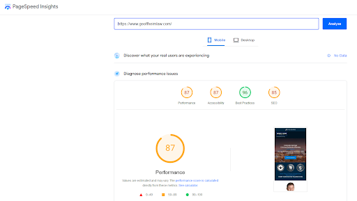
For example, we conducted a mobile PageSpeed test on Geoffheimlaw. Upon completion, Google offers four distinct scores to evaluate the performance and user experience of both mobile and desktop versions of the site.
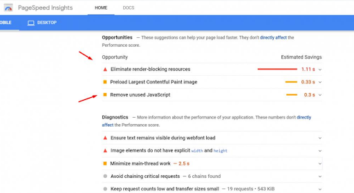
Based on the audit, several areas for improvement were identified to enhance the page performance of Geoffheimlaw. These include addressing JavaScript issues, eliminating render-blocking resources, and optimizing image sizes. After resolving these issues, the page speed of Geoffheimlaw has significantly increased, as demonstrated in the screenshot below.
What Does Mobile-First Indexing Mean for SEO?
Mobile-first indexing is a critical shift in how search engines, notably Google, prioritize websites for ranking. As mobile devices surpass desktops in internet usage, search engines have adapted by focusing primarily on the mobile version of a website for indexing and ranking purposes. This means that the mobile site’s content, performance, and usability are now the primary factors influencing search engine rankings.
For SEO, this transition underscores the importance of optimizing the mobile experience. Websites must ensure their mobile versions are fully functional, with fast load times, intuitive navigation, and high-quality content. The mobile-first approach highlights the need for responsive design, where a site adapts seamlessly to different screen sizes, and encourages mobile-friendly practices such as readable text without zooming and accessible touch elements.
Webmasters should regularly test their mobile sites for performance and usability issues. Ensuring that mobile and desktop versions of a site offer similar content and a consistent user experience is crucial for maintaining high search engine rankings and achieving better visibility in search results.
Optimize for Mobile Success – Schedule Your Free Consultation Today!
Looking to boost your online presence in today’s mobile-first indexing world? At Attorney Marketing Network, we specialize in Law Firms and SEO for Lawyers, understanding the critical importance of mobile optimization for top search engine rankings. Ensure your website stands out with a fast, user-friendly mobile experience that engages visitors and drives results. Don’t let your competition outpace you—contact us to schedule your free consultation today and discover how we can enhance your mobile strategy. Let’s work together to ensure your site performs flawlessly on all devices and achieves the visibility it deserves. Reach out now to start optimizing for success!

